01 — The problem
A brand built over decades. A website that didn't show it.
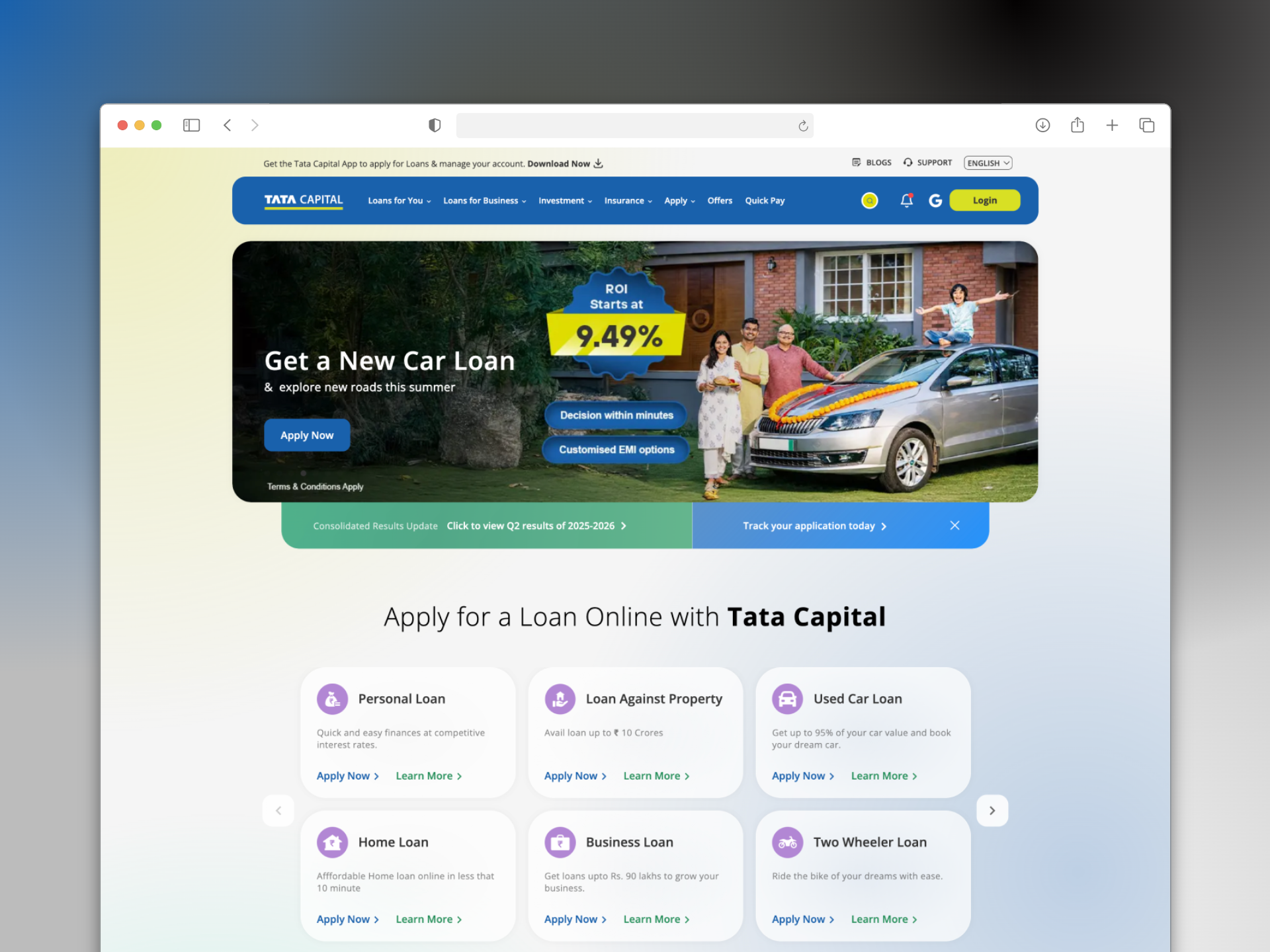
Tata Capital came to us with three compounding problems. The website was underperforming on lead generation. Product discovery was broken — users landing on the site had no clear way to find the full range of offerings beyond loans. And younger fintech competitors were acquiring customers through modern, mobile-friendly experiences that made Tata Capital's digital presence look dated by comparison.
The business stakes were clear: Tata Capital wasn't just another financial services provider — it was one of India's most trusted brand names. But trust built over decades was being quietly eroded by a website that hadn't kept pace with how people now discover and apply for financial products.
Discovery failure
Users didn't know Tata Capital offered investments, insurance, and wealth products — only loans. The site wasn't surfacing the full product suite.
Lead generation drop-off
Analytics showed drop-offs from loading issues and complicated forms. Leads were being lost before users ever reached an application.
Mobile experience gap
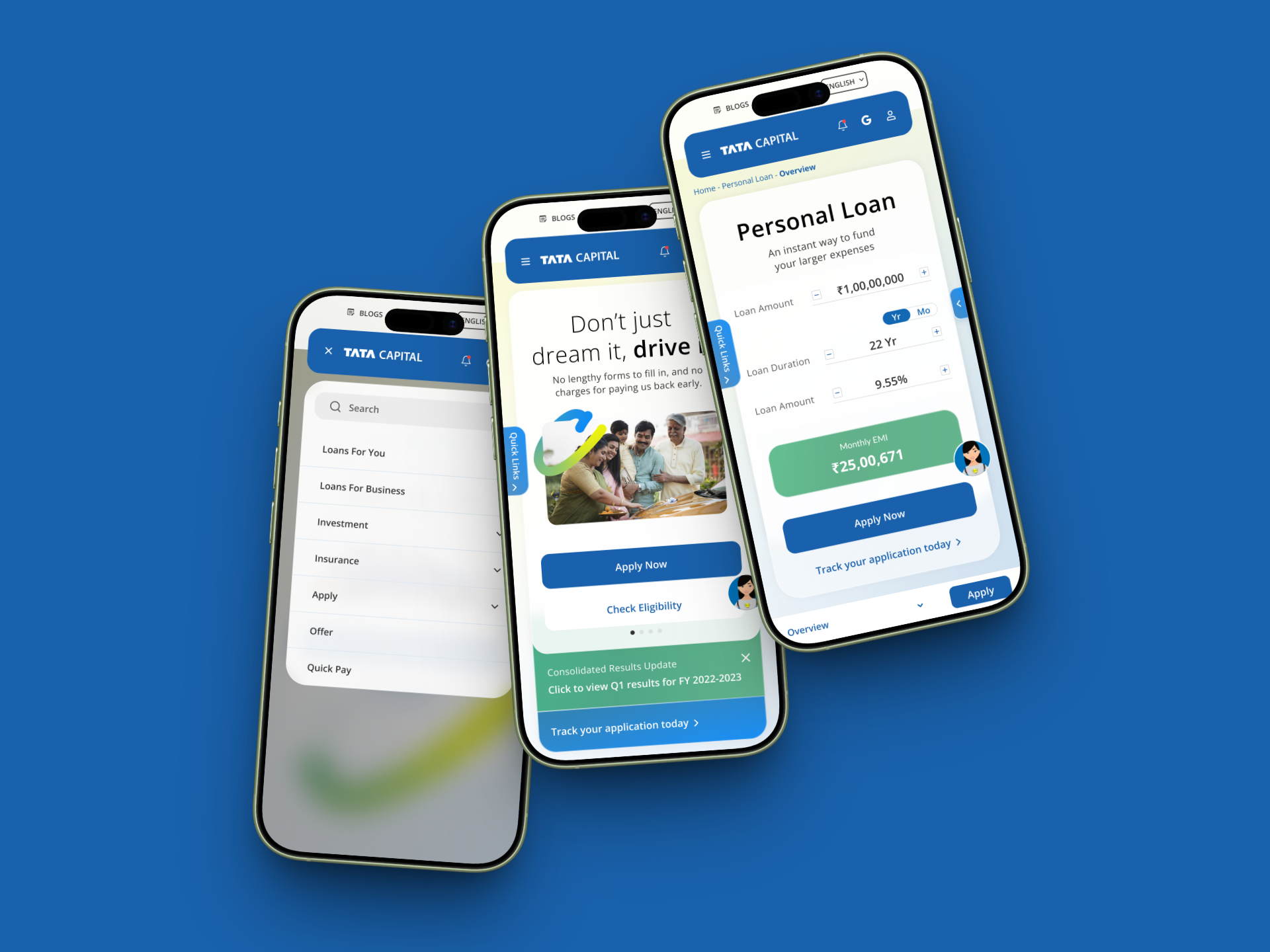
90% of users accessed via mobile. The site wasn't designed for them — it was a desktop experience forced onto a phone.
Trust erosion
An unmodernised UI was signalling neglect. Users comparing Tata Capital against younger fintechs were choosing the fresher-looking alternative.
02 — Users
Three distinct users. One website that had to serve all of them.
Tata Capital's product range meant the website needed to work for fundamentally different intents simultaneously. I anchored design decisions around three user types — with Rohan as the primary lens.
Rohan, 35
Working professional researching vehicle loans on his phone from home. Comparing multiple lenders. Needs eligibility check and trust signals — without visiting a branch.
Gen Z, 20–28
Accessing personal loans for phones, travel, or emergencies. Expects a smooth digital journey. Will leave immediately if the experience feels clunky or dated.
Millennial / Business, 30–45
Exploring home loans, car loans, or business financing. Higher-stakes decisions that require clear information, calculators, and credibility signals.
What united all three was a single unmet need: the ability to discover, understand, and act on a Tata Capital product entirely from a mobile screen — without friction, without confusion, and without having to trust a brand they couldn't see was still invested in its own digital experience.
03 — Strategic direction
Stop following competitors. Start setting the standard.
My north star for this project was a simple question applied to every decision: how easy is it to find a Tata Capital product? Discovery was the root problem. If we solved discovery, lead generation and trust would follow.
The harder strategic challenge was cultural. The client's instinct — understandably — was to benchmark against competitors. Every design decision needed to be validated by pointing to someone else who had done it. I pushed back on this directly.
"We are supposed to be market leaders. We should be building experiences that inspire competitors to copy us — not the other way around.
To make this argument land, I presented design options in pairs: the safe, competitor-validated direction alongside the bolder alternative, with explicit reasoning for each. This gave the client a genuine choice rather than a design decree — and consistently, the evidence behind the bolder option was compelling enough to move them forward.
I also set a lens that every designer on the team used to pressure-test suggestions: this website belongs to a legacy brand. It can feel modern and fintech-forward, but every decision must still speak from a position of trust. Modern doesn't mean disposable. Accessible doesn't mean simple-minded.
04 — Process
Desktop as inventory. Mobile as editorial filter.
With 90% of users on mobile, we designed mobile-first — but not mobile-only. Desktop wireframes served a specific strategic purpose: they let us lay out the maximum number of elements a page could contain, understand the full information hierarchy, and make explicit decisions about what was essential vs. decorative.
Desktop
Used as an element inventory. Established maximum information hierarchy and product relationships before any reduction.
Mobile
The editorial filter. Every element debated: does this help Rohan make a decision? If not, it moves or goes.
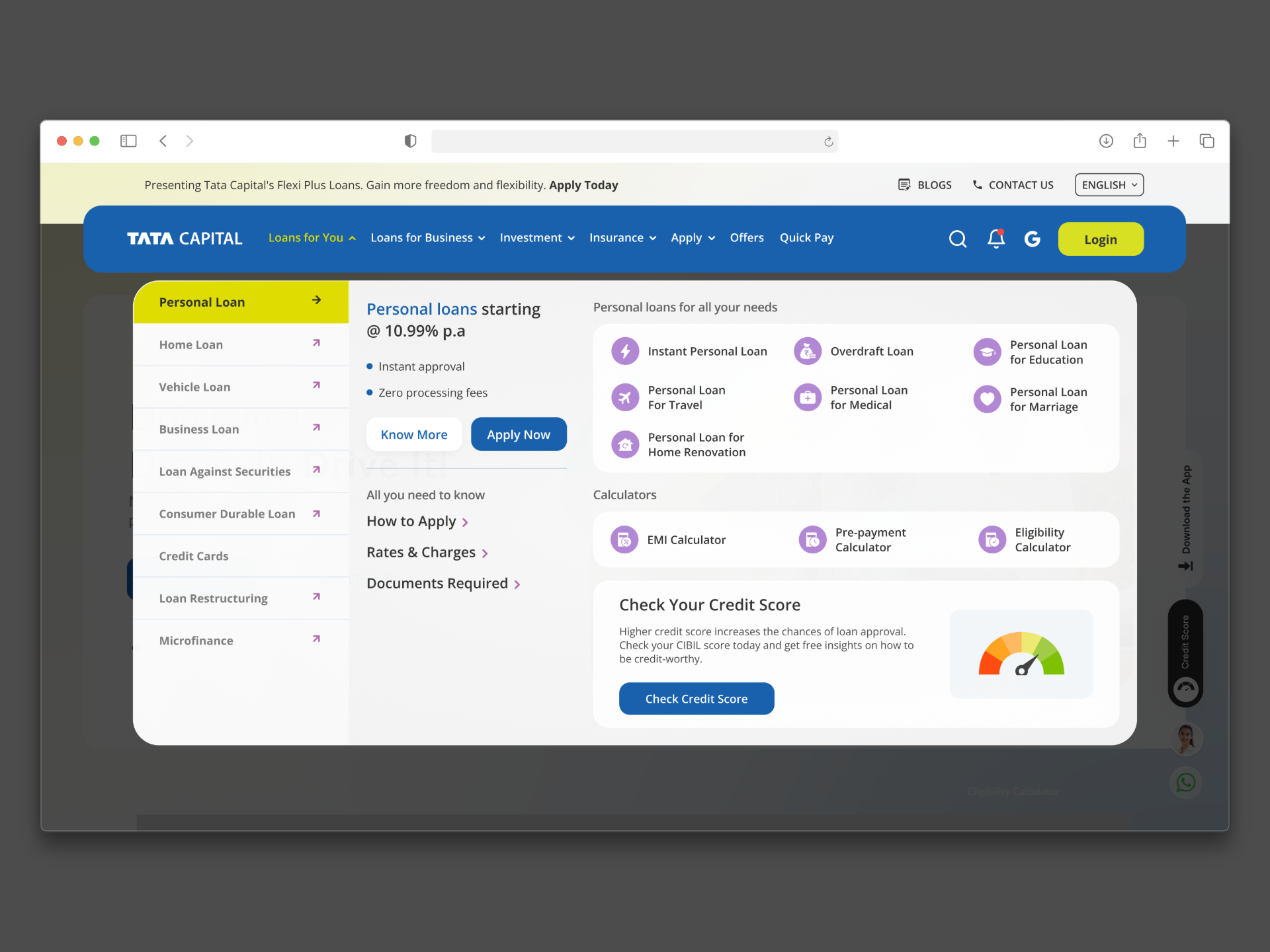
The navigation redesign was the most structurally important decision. With loans, investments, insurance, and wealth products all competing for attention, I grouped the product suite into clear intent-based headers — users coming with a loan intent, an investment intent, or a business need could each find their path immediately without scanning the full menu.
The SEO content challenge required a different kind of creativity. The text slabs couldn't be removed — they were critical for Google rankings across product pages. So rather than fighting the constraint, we designed around it: adding icons, comparison tables, indentation, and structured formatting that transformed dense text into something genuinely readable on a small screen. Same words. Completely different experience.
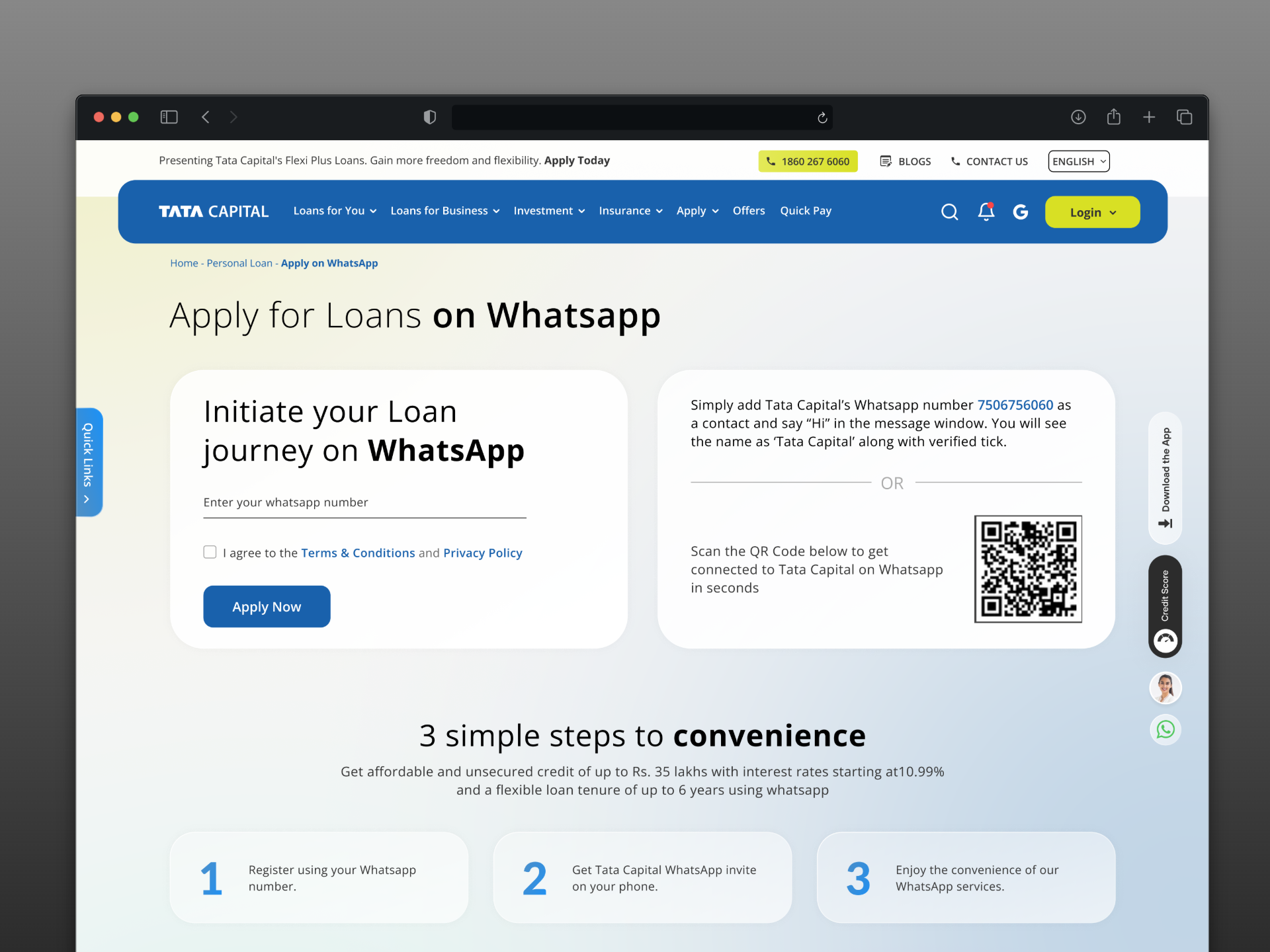
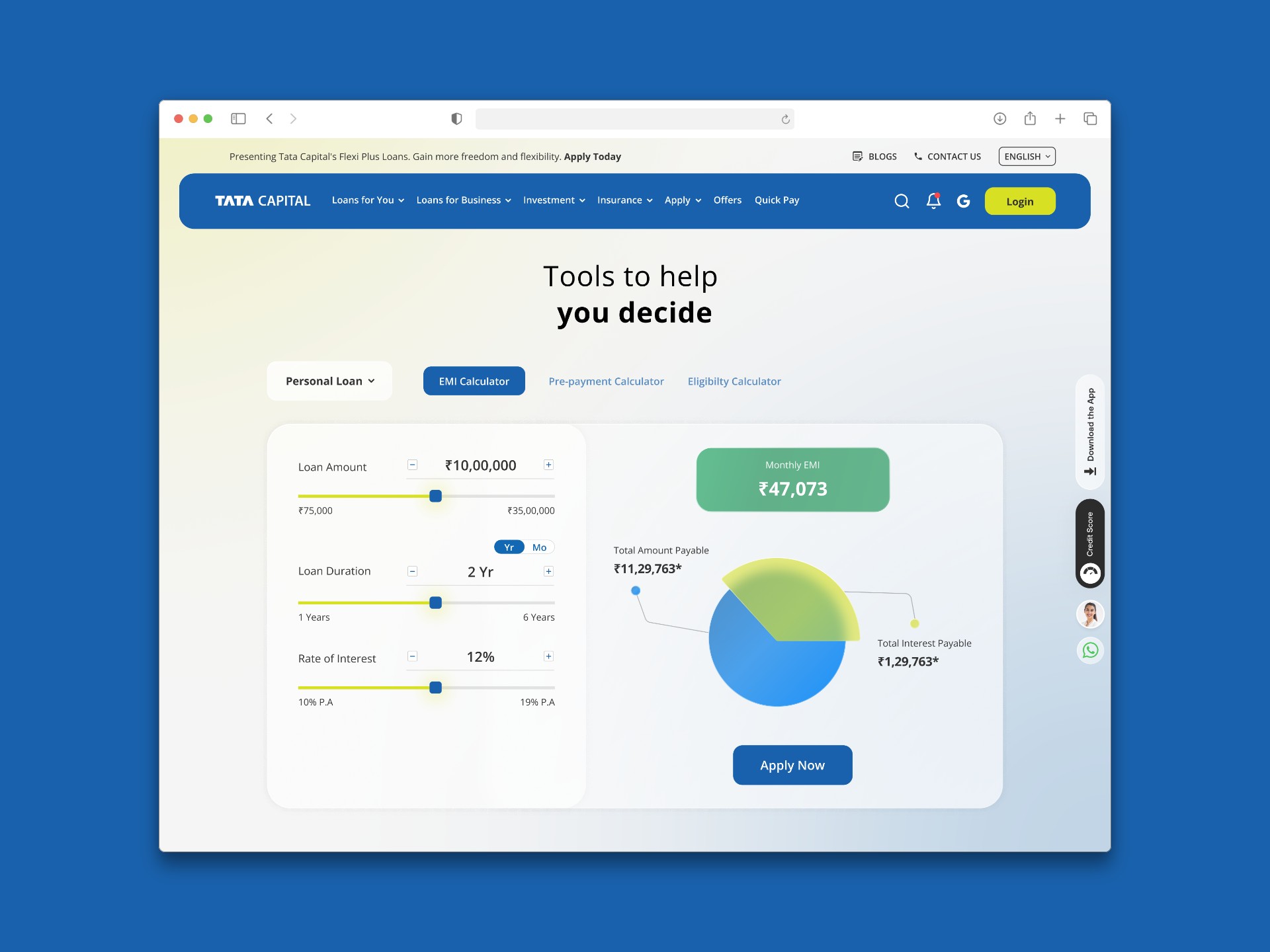
The homepage anchored the visual direction. Glassmorphism — a design language more associated with consumer apps than legacy financial institutions — was a deliberate bet. Applied with restraint, it gave the site a fresh, modern feel while the underlying architecture, information hierarchy, and Tata brand language kept it grounded in trust. Users could check loan eligibility, explore products, and use calculators without ever leaving the homepage.
05 — Design principles
Lenses every decision ran through.
Legacy trust, modern expression
The website belongs to a brand built over decades. Every modern design choice — glassmorphism, bold typography, fresh layouts — must still speak from a position of trust and credibility. Modern doesn't mean starting over.
Accessible, not just attractive
Fitting into the fintech ecosystem is not enough. The design must be accessible and easy to navigate for every user — from a 22-year-old Gen Z on a budget phone to a 45-year-old business owner comparing loan rates.
Discovery as a conversion tool
If a user doesn't know a product exists, they can't apply for it. Every page, every navigation grouping, every homepage section is a discovery opportunity — not just an information display.
Set the standard, don't follow it
Tata Capital is a market leader. Design decisions must be made from that position — building experiences that inspire competitors, not validating choices by pointing at what others have already done.
06 — Outcomes
A site that earns its place in the modern fintech landscape.
Post-launch, the website held its own alongside the new generation of Indian fintech products — modern in feel, but distinctly Tata in its authority and depth. Lead generation improved. Page load speeds increased. The mobile experience finally matched the scale of the brand it represented.
The clearest signal of success: The digital team was excited to showcase the new design publicly — and early user response validated the direction. The site felt like Tata Capital had made a statement, not just an update.
Downstream impact
The success of the Tata Capital website redesign led directly to being handed the Tata Capital Wealth redesign — their premium product line for high-net-worth users. When a legacy brand trusts you with their most valuable customer segment, that's the strongest possible endorsement of the work.
For Rohan — and every user like him — the difference was tangible. He could now land on the site from a Google search, check his vehicle loan eligibility, understand the benefits, compare rates, and begin an application entirely from his phone on the couch. The branch visit he wanted to avoid was no longer necessary. The experience finally matched the trust the brand had already earned.
07 — Reflection
What I'd do differently.
This project reinforced something I now apply to every enterprise redesign: the design team's job isn't just to make the right thing — it's to make the client confident enough to choose the right thing. The two-option presentation format I developed here, showing the safe path alongside the better one, became a core part of how I present to legacy clients.
If I ran this project again, I'd push harder for direct user testing earlier in the process — particularly with the mobile navigation. Analytics told us where users dropped off, but conversations with Rohan-type users would have surfaced the why much faster, and given us stronger evidence to move the client further from their instinct to play it safe.