01 — The problem
Women had the intent to save. Every existing tool failed them.
LXME came to us with a clear business goal: empower women in India to take control of their finances digitally. The insight driving it was sharp — if a woman can navigate Instagram and share on WhatsApp, she has the digital literacy to run a fintech app. The barrier wasn't capability. It was design.
The existing app was built for a general audience, which meant it was built for no one in particular. The language was technical. The interactions assumed financial familiarity. The experience felt like every other fintech product — designed by men, for men, with women as an afterthought.
"Banking is complicated for us women. It's a man-only activity.
Two barriers compounded each other: complexity and trust. Women found financial tools hard to understand, and harder to trust. The result was Rashmi — a 34-year-old tailor, part-time earner — storing her savings in a physical money box at home. Not because she couldn't save, but because every formal channel had failed to earn her confidence.
02 — Research
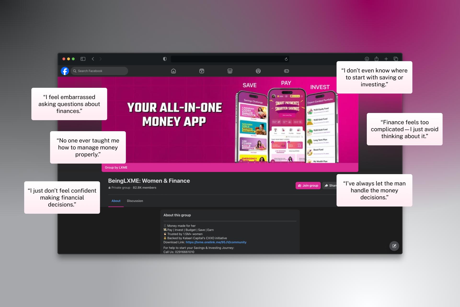
We went where women were already talking.
There was no direct competitor to benchmark against — we were building a category that didn't exist. So instead of looking sideways at other fintech apps, I looked at where our users already engaged with financial content: the LXME Facebook community, where the founding team had spent years running savings challenges, giveaways, and financial education sessions via Zoom.
That community became our primary research signal. We studied what women engaged with, what language they used, what made them lean in — and what made them scroll past. We cross-referenced this with direct user interviews, speaking to women before every major design decision, not just when we were stuck.
Insight 1
Women wanted an app as simple as GPay or PhonePe — not a banking dashboard.
Insight 2
They wanted to learn before they acted. Trust had to be built through education, not just UI polish.
One assumption we stress-tested early: women weren't avoiding fintech because they lacked interest. They were avoiding it because the emotional contract had never been made. No app had ever said, in tone and in design: this was made for you.
03 — Strategic direction
The north star: finance should feel like a friend.
Before a single screen was designed, I defined the filter that every decision would run through: what would a best friend say here? Not a banker. Not a compliance officer. A best friend who happens to know about money.
This wasn't just a tone of voice decision — it was a structural one. It meant the app had to teach before it asked users to act. Build trust before it asked for data. Celebrate small wins before it introduced complexity. Learn, then save, then grow.
I presented design directions in a consistent format: the obvious path alongside the alternative, with explicit pros, cons, and the reasoning behind my recommendation. This approach — evidence-backed, options-led — was how I built the client's trust in decisions that had no industry precedent to point to.
04 — Design principles
Three principles that governed every decision.
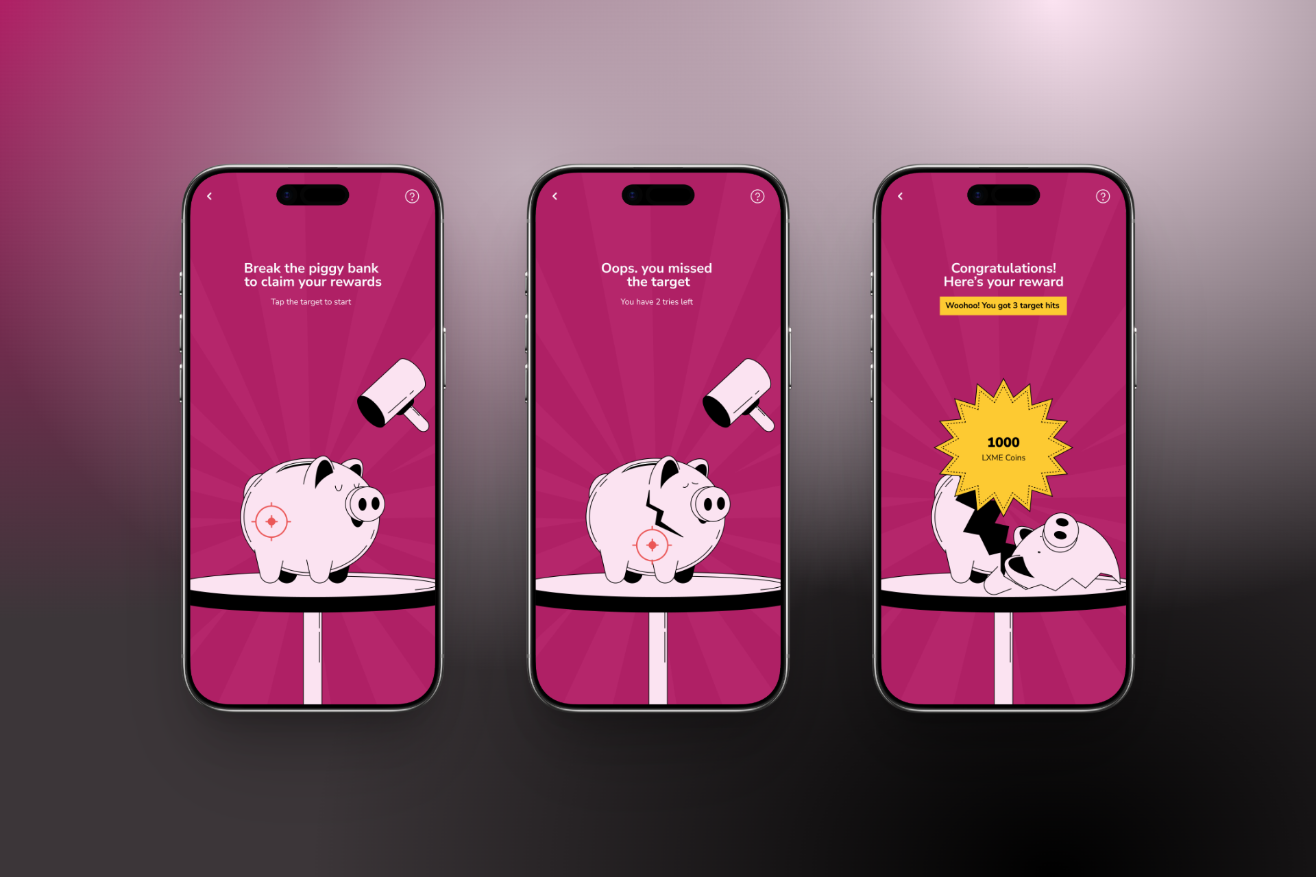
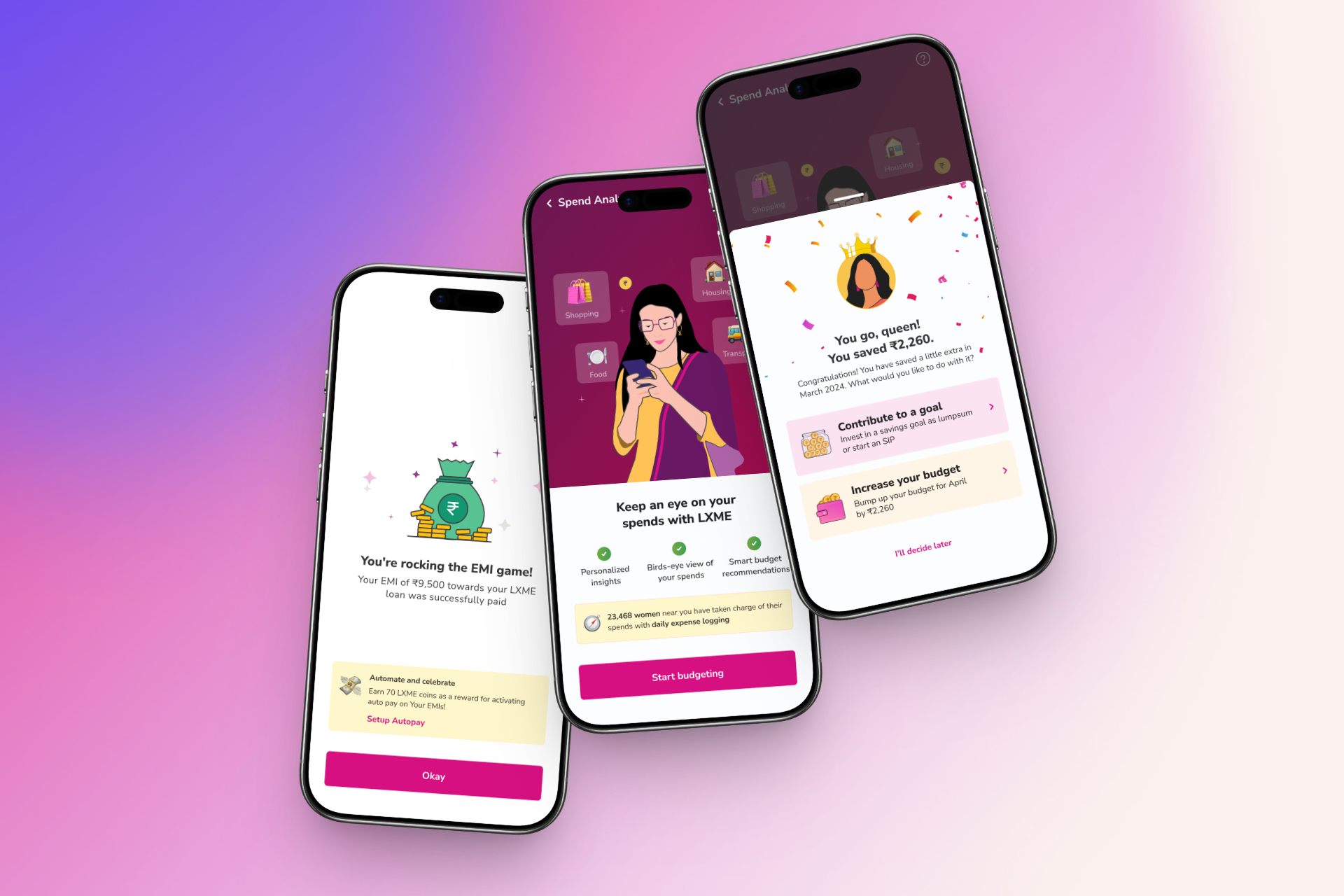
Emotional design — subtle, not loud
Money is emotional. Success states should feel reassuring, not flashy. Avoid alarming language. Use a tone that is calm, warm, and in control.
Compliance-aware design
KYC flows must be smooth but compliant. Consent screens clear and explicit. Data transparency is a trust-building feature, not a legal formality.
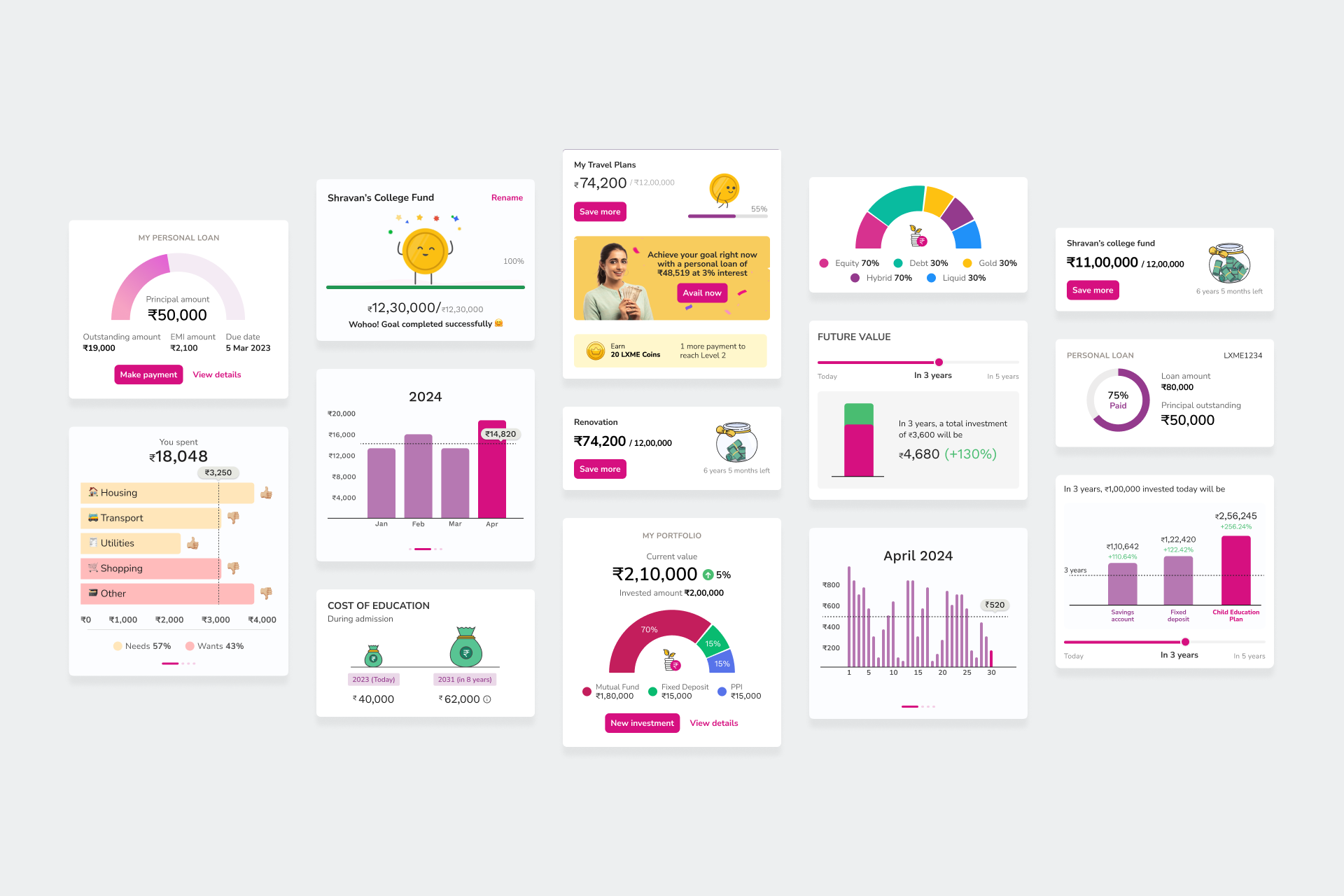
Data viz that actually helps
Clear, focused visuals that turn financial data into immediate, actionable insights. Every chart guides a decision, not just attention.
05 — Process
A weekly rhythm that kept quality and speed in balance.
I ran the design team on a structured weekly sprint cycle with three fixed touchpoints:
Monday
Feature planning, scope, and direction set.
Wednesday
Mid-week WIP review. Calibrate and unblock.
Friday
Client presentation & feedback collection.
The Wednesday calibration was the most important touchpoint — it was the moment I could redirect work before it went too far in the wrong direction, rather than catching problems at the Friday presentation. This protected the team's time and the client's trust.
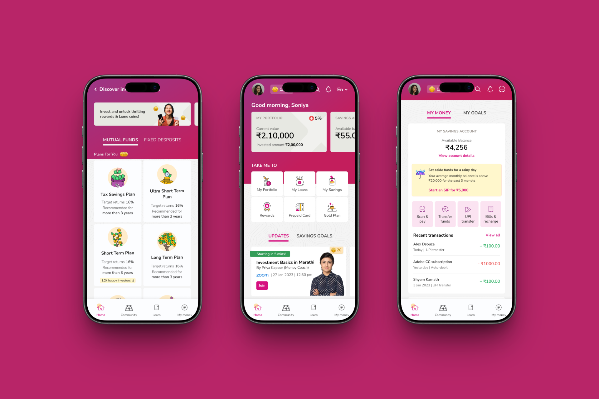
06 — The work
Language and illustration as the primary design medium.
The most impactful design decisions on LXME weren't layout choices — they were language choices. Early on I identified that copy and illustration were carrying as much weight as any interaction pattern. If the words felt like a banking manual, the design had failed regardless of how clean the UI was.
The "PAN-tastic" reframing
Before
"PAN verified successfully"
After
"PAN-tastic news! PAN Verification Succesful."
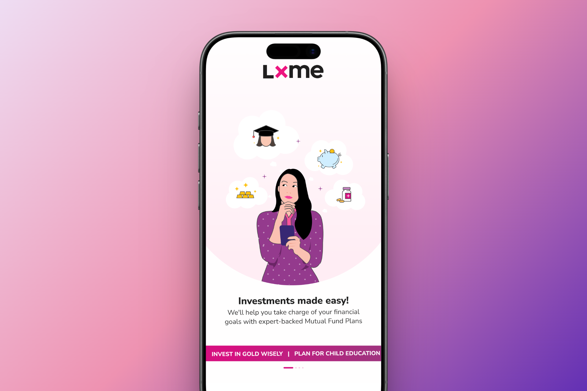
Illustrations followed the same logic. Every illustration contained a human element — a hand holding a phone for OTP screens, women doing specific actions for larger moments. Crucially, all illustrations featured Indian women in local contexts, adding relatability that no generic stock illustration library could provide.
07 — Outcomes
10 lakh downloads. 4.4 stars. Women actually using it.
10L+
Downloads
4.4★
App Store rating
"The app has completely changed the way I manage my money. Budgeting is much easier now. Clean interface, helpful insights, and super easy to track my expenses. Highly recommended. The reminders for bills and the savings goals feature are a game changer. Overall I just loved it."
— App Store review, post-launch
08 — Reflection
What I'd do differently.
My biggest learning from LXME: I would keep women in the loop continuously, not episodically. Our process brought users in when we finished a feature or when we got stuck. That worked, but it meant we were validating decisions rather than co-creating them.
A more mature version of this project would have embedded women — users like Rashmi — as ongoing collaborators at every stage of design, not just as a feedback mechanism at the end. That shift from validation to co-design would have made the work even stronger, and it's how I approach projects now.